Iron Man Mark VI – Iron Man 2
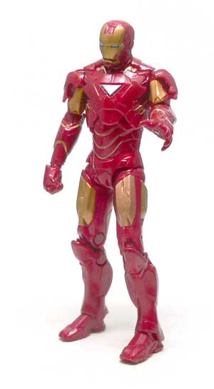 This was actually one of the first of the Iron Man 2 figures I bought. Why did I wait so long to review it? Well, I really wanted to wait until I saw the film to understand if there was really anything different in this suit.
The main difference is noticeable right away. Instead of a large glowing circle on Tony’s chest there’s a triangle. I wondered about a lot, since the engineer in my seems to think the circular design makes more sense structurally. But hey, that’s just me.
Yes, in the film the change is kind of explained. I’ll leave it at that for now.
Appearance:
For the most part, there really weren’t very many changes to basic suit design. There’s some pretty subtle stuff, but the circle-triangle thing is the most major change. And really at this point, Hasbro has the design down.
The suit looks pretty good. As my first ever Iron Man figure, I have to say I was pretty pleased. I picked this version over the light up one, because I really just wanted a basic Iron Man for my collection.
I actually was pretty impressed with the decal representations of the hand repulsors and Arc reactor light. The right fist hand even has a partially obscured circle. Nice attention to detail there. My only wish is that had done the ones on the feet as well. There’s a hole that you could plug a flight stand (not included) into his back. If he’s in the air, it’d be nice to have the feet repulsors there.
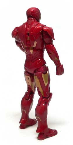 One of the other things I like about this figure is the way the shoulder pads were done. Instead of hinges like the War Machine figures, these are actually rubber pieces that flex over the shoulder joints. This slims down the look of them to something more appropriate to the sleek look of this Iron Man suit.
In general, I really don’t have anything bad to say about the paint on this guy. The red is nice and shiny and the gold is crisp and where it should be.
Now there are a couple of items that I think could be improved. There always is, isn’t there?
The first is the right hand. Like 90% of the rest of the line it is sculpted as a fist. Yeah it’s nice to have a fist to pummel the bad guys with. But, frequently in both films, Tony is shown using the repulsor in the right gauntlet. A second open accessory hand would have been a very well received accessory I would think.
The second issue crosses into the ‘Fun’ category. The head articulation is very limited. Unfortunately, this gives Iron Man the constant appearance of looking down. It is a ball joint, but due to the design can only really turn left and right. A little back and forth could’ve went a long way.
Fun:
 This version of Tony Stark’s powered up armor is one of those figures that is just fun to play with. I guarantee if you leave this next to your keyboard, you’ll find yourself trying to out the figure in a variety of poses.
The armored look of the figure does a great job of concealing the articulation. While I’m not a big fan of the chest joint on figures, it’s pretty well done here.
The only place the articulation seems a little odd is at the wrists. The hands looks slightly bigger than the wrists. It’s a small thing, and for the most part forgivable.
As with all big summer movie figures, IM Mk. VI comes with the requisite missile launching doodad. This one is a large oversized piece that clips to his forearms. It’s done in read and gold, so it blends well with the figure. I’m grateful this was removable and not integrated into the figure’s arm.
 This figure also comes with the other gimmick piece for this line. The stand with the card holder. Okay, I played around with the cards a bit. Yawn. I can’t see how even a kid would find that fun. It’s probably the OCD in me that fights against the mixing.
What I could see though, is an enterprising diorama builder integrated these into a Tony Stark lab display. Either as holograms or control panels or something. I really wish all three cards were printed on clear for that reason alone.
There’s one thing that puzzles me about this figure. The package has a sticker on it that states “2 Powerful Projectiles” on the front. However, I can only find one in the package. I know some of the other figures come with two missiles for the launcher, but as far as I can tell this one only has one.
Overall:
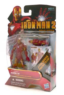 I’m pretty pleased with this version of Iron Man. While it’s not the suit that he wears for the majority of the film, I suspect it will be the look for the next film. The overall appearance of the figure is great, with really no major issues. If they had threw in an open right hand, it would have been darn near perfect.
The fun factor is definitely there, as well. A highly articulated version of that would be fun for any collector or kid. Also for the kids is a nifty launcher that doesn’t interfere with the basic figure. Great job appealing to the collectors and kiddos, Hasbro.
If you were only going to get one Iron Man for your collection, this version wouldn’t be a bad way to go.
Engineernerd Score: 97/100
Category: Featured, Iron Man, Marvel, Toy Reviews



Very nice figure, and great review. I’ve yet to find one Mk.VI with a paintjob I can live with, but I think I’ll go for the non-light up one too, for pretty much the same reasons you have.
This figure is really good, and I have three copies of this exact mold: one in the color scheme as the one you have reviewed here (red and gold without silver) with a slightly imperfect paintjob, one in the more movie accurate color scheme (red and gold with some silver on the thighs, knees, upper arms and abdomen) with a perfect paintjob and one that has the movie accurate color scheme (red and gold with some silver on the thighs, knees, upper arms and abdomen) but is painted wrong (“red” parts that look pink and a face that is mostly red because the golden paint wore off or was misapplied). This last one is the one I usually play with and I have plans to have it repainted in red and silver (with red paint where the figure was originally supposed to be red and silver where the figure was originally supposed to be golden).